Tutorial
Build a presentation with quarto-touying-typst
This walkthrough mirrors Quarto’s Reveal.js tutorial, but targets Touying — the Beamer-style presentation framework for Typst. If you have written Reveal.js slides in Quarto, almost everything here will feel familiar.
Overview
quarto-touying-typst is a drop-in Quarto extension. You write ordinary Quarto Markdown and get a Typst-rendered PDF deck, with a built-in theme chosen by a single theme: option. Install it into a project with:
quarto add kazuyanagimoto/quarto-touying-typstA minimal presentation is just a .qmd file with format: touying-typst:
---
title: "Habits"
author: "Your Name"
date: today
format: touying-typst
theme: metropolis
---
Render it the usual way:
quarto render slides.qmdDon’t have a project yet? Start from the template:
quarto use template kazuyanagimoto/quarto-touying-typstCreating slides
Slides are delineated by Markdown headings, exactly like Touying’s native = / == and like Reveal.js:
- A level-1 heading (
#) starts a section (a divider slide). - A level-2 heading (
##) starts a content slide.
# In the morning

## Getting up

- Turn off alarm
- Get out of bed

## Breakfast

- Eat eggs
- Drink coffee
The # heading produces a section divider, and each ## becomes a slide:
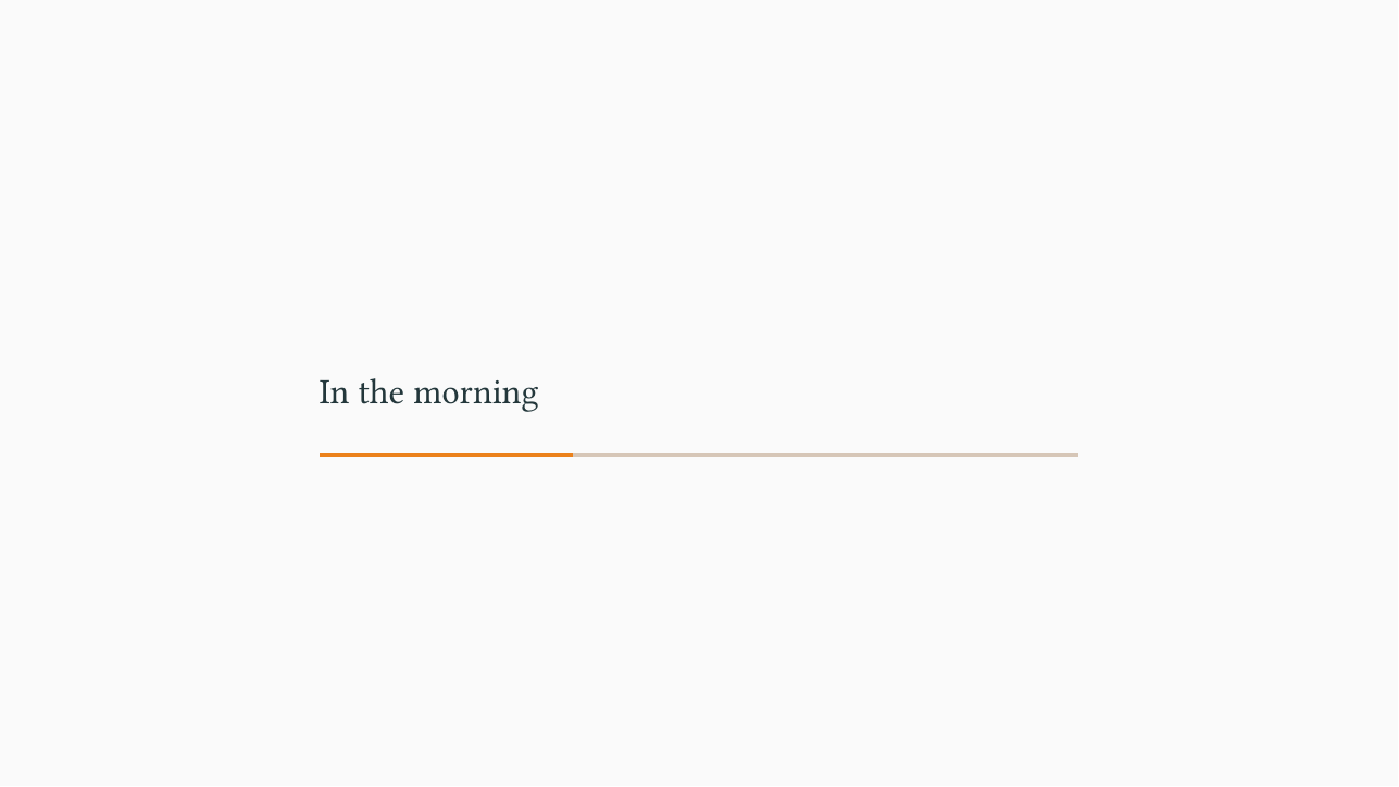
# In the morning → a section divider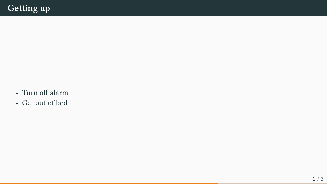
## Getting up → a content slideBreaking a slide without a heading
A horizontal rule (--- on its own line) starts a new slide that carries no heading — handy for splitting a long slide or adding a heading-less follow-up:
## A long topic

First half of the content.

---

Second half, on a fresh slide.
This mirrors Touying’s native horizontal-line-to-pagebreak behaviour.
Title slide
A title slide is generated automatically from the title, subtitle, author, and date fields in your YAML front matter.
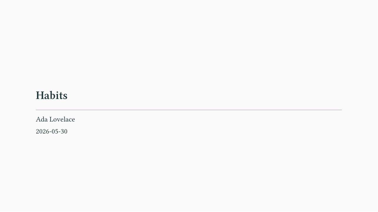
The clean theme also renders structured authors with affiliation, email, and ORCID — see the gallery.
Heading levels
By default Quarto promotes the shallowest heading, so a deck that uses only ## turns those into section dividers. Either put a # section before your ## slides, or disable the promotion so ## always stays a slide:
format: touying-typst
shift-heading-level-by: 0   # `##` stays a slide even without a leading `#`
This is handy when porting a Reveal.js deck that only uses ##.
Incremental content
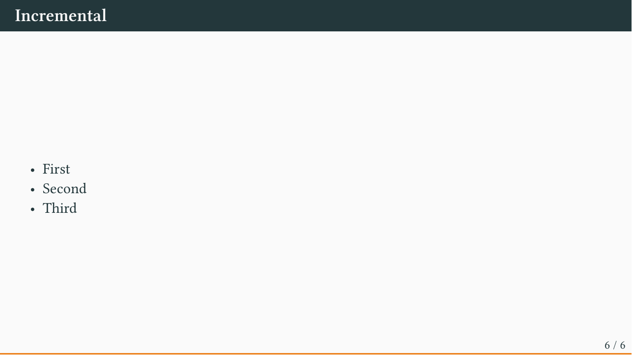
To reveal content step by step, wrap it in a .incremental div:
::: {.incremental}
- First
- Then second
- Then third
:::
You can also break anywhere with a pause marker — three dots on their own line:
First this shows.

. . .

Then this appears.
.only / .uncover reveal a span or a whole block from a given sub-slide on (the options are passed straight to the Touying function):
[shown from sub-slide 2]{.only options='"2-"'}

::: {.uncover options='"3-"'}
This block is uncovered on sub-slide 3.
:::
For fine-grained control (revealing across multiple sub-slides, hiding rather than appending), use Touying’s uncover / only / alternatives inside a .complex-anim block:
::: {.complex-anim repeat="4"}
At subslide #only("2-")[two and later] and #uncover("3-")[three and later].
:::
Multiple columns
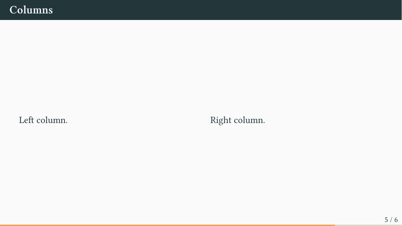
Place content side by side with .columns / .column and a width:
:::: {.columns}
::: {.column width="40%"}
Left column.
:::
::: {.column width="60%"}
Right column, a little wider.
:::
::::
width attributeContent
All of the standard Quarto + Typst content works without any extra setup.
Equations
Inline $E = mc^2$ and display math render with Typst’s typesetting:
$$\int_0^1 x^2 \, dx = \frac{1}{3}$$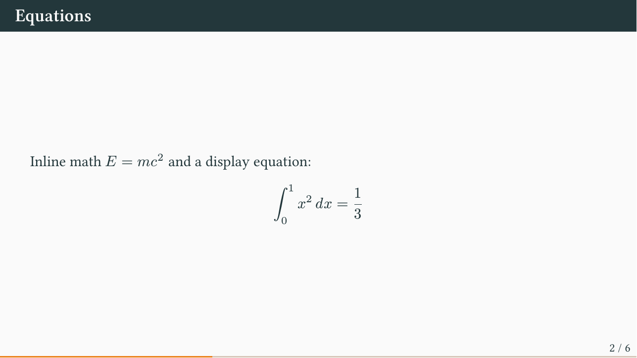
Code blocks
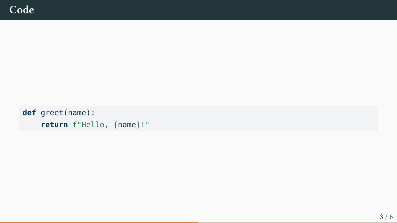
Fenced code blocks are syntax-highlighted:
```python
def greet(name):
    return f"Hello, {name}!"
```
Executable code works too — add an R or Python chunk and Quarto runs it, embedding the output (figures, tables) into the slide. Source is hidden by default in presentations; show it with echo: true.
Tables and images
Markdown tables and  images render as expected. For richer tables, use tinytable from an executable chunk.
Themes
Switch the whole look with one option:
format: touying-typst
theme: dewdrop   # default | simple | metropolis
                 # dewdrop | university | aqua | stargazer
Seven themes ship with the extension. The styled clean theme is a separate Typst Universe package used through the external-theme path. Browse them all — and flip through a full deck in each — on the Gallery page.
You can nudge colours and fonts from the front matter:
accent: "1f6feb"       # primary colour (hex, no #)
accent2: "9a2515"      # secondary colour
jet: "1b1f24"          # body text colour
mainfont: "Source Serif"  # body font
sansfont: "Fira Sans"     # heading font
monofont: "Fira Code"     # code font
Colours (accent / accent2 / jet) and fonts (mainfont / sansfont / monofont) apply to every built-in theme and to clean. Whether they reach another external theme depends on how that theme is written; see External themes. accent also colours the .button and .small-cite helpers. A styled theme’s own extra knobs (font sizes, weights, etc.) are set on the theme function with .with(...).
Brand
A Quarto brand (_brand.yml or a brand: key) is picked up automatically as a fallback for the options above, and reaches the same themes they do. brand.color.* set the palette, and brand.typography.base / headings / monospace set the body, heading, and code fonts:
brand:
  color:
    primary: "#1f6feb"
    secondary: "#cf222e"
    foreground: "#1b1f24"
  typography:
    headings: { family: "Fira Sans", weight: 600 }
    base: { family: "Source Serif 4" }
Explicit accent / sansfont / … always take precedence over brand.
External themes
You are not limited to the built-ins: any Touying theme works, whether you wrote it yourself or installed it from Typst Universe. The recipe is always the same two steps:
- Bring the theme’s function into scope with
include-in-header. - Name that function with
theme-typst(its title slide defaults totitle-slide; settheme-title-slideif the theme calls it something else).
A custom theme file. Suppose you have a mytheme.typ defining a mytheme-theme function (and a title-slide), such as the deck built in Touying’s Build Your Own Theme guide. Point include-in-header at the file:
format:
  touying-typst:
    include-in-header: mytheme.typ
    theme-typst: mytheme-theme
A Typst Universe package. Import it inline with the text: form. (Writing a bare @preview/... as a plain YAML value will not work: Pandoc parses the @ as a citation.)
The styled clean theme is loaded this way, and its title slide also takes structured authors (affiliation, email, ORCID):
format:
  touying-typst:
    include-in-header:
      text: |
        #import "@preview/touying-quarto-clean:0.2.0": *
    theme-typst: clean-theme
Either way the front-matter title / author / date feed the theme’s title slide. accent / accent2 / jet (or brand.color.*) map onto Touying’s standard colour palette (config-colors), as they do for the built-in themes, so they take effect wherever the theme draws its colours from that palette (self.colors). The clean (Universe) and bamboo (custom) decks on the Gallery page are live examples.
A theme pinned to an older Touying version usually still works. If it hard-codes a font you don’t have installed, fetch that font with brand; the clean deck does this, pulling Roboto and Fira Code from Google so the deck renders the same on any machine.
Fonts depend more on the theme than colours do, because Touying has no standard font setting. The deck fonts (mainfont / sansfont / monofont, or brand.typography) are set document-wide, which is enough for a theme that leaves the font family alone, as bamboo and the built-in themes do. A theme that sets its own fonts overrides the document-wide ones, so the extension also passes the deck fonts to the theme function as font-family-body / font-family-heading / font-family-mono, the option names clean uses. A theme that names its font options differently ignores these and keeps its own fonts; set them through that theme’s own options with .with(...) instead. Where the deck fonts do reach the theme’s options, they take precedence over the same options set with .with(...) in the header, as the colours do.
A theme’s other options (font sizes, weights, etc.) are set by rebinding it before use, e.g. #let clean-theme = clean-theme.with(font-size: 22pt). When a theme package exports its own .button / .fg / .bg helpers (as clean does), importing it with : * makes those take over from the base versions, so they match the theme automatically.
Native Touying
Anything Touying can do is available as raw Typst. Inline #pause, #meanwhile, and any Touying function can be dropped straight into your Markdown. A few extras:
aspect-ratio: "16-9"   # or "4-3"
handout: true          # collapse every incremental reveal into one slide
Mark the start of back-matter with the appendix shortcode — it freezes the slide counter so appendix slides don’t inflate the total in the footer:
{{< appendix >}}

## Extra slide